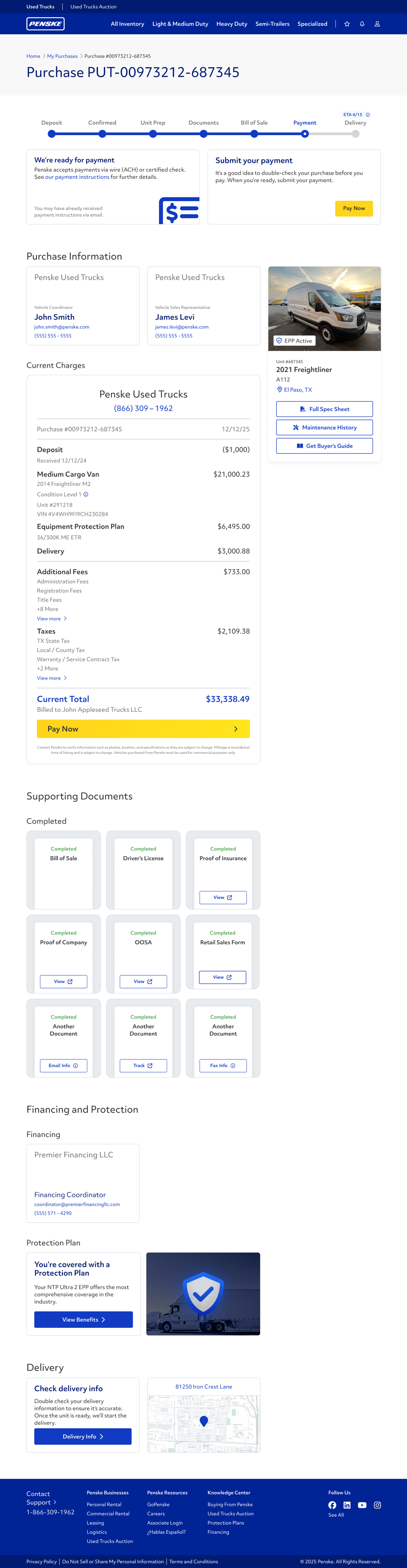
My Purchases
Problem
The entire process of purchasing a used truck from Penske is done via fragmented emails, phone calls, and text messages. It's never clear to users where they are in the process, how they got there, or what is needed from them to get to the next step.
Solution
A new kind of page that shows which

My Purchases
Spring 2026
Penske Logistics
This is the first feature I worked on that made it to launch! I learned a lot about technical constraints, storytelling, stakeholder buy-in, product politics, product vision, and incremental release.
My Purchases
Spring 2026
Penske Logistics
This is the first feature I worked on that made it to launch! I learned a lot about technical constraints, storytelling, stakeholder buy-in, product politics, product vision, and incremental release. What was a half-forgotten screen with key-value pairs turned into a tentpole feature of the new design for the site. Reception has been fantastic in the months since launch, too, so we're building the features users are asking for the most.
Problem
The entire process of purchasing a used truck from Penske is done via fragmented emails, phone calls, and text messages. It's never clear to users where they are in the process, how they got there, or what is needed from them to get to the next step.
Solution
A new kind of page that shows which
Interaction Designer
I designed how the user interacts with the products through input and output.
UI Designer
I designed the visual and interactive experience of using the product to spark delight.
UX Designer
I designed the experience of using the product based on research, testing, and intuition.
Used trucks customers buy their vehicles through vehicle sales coordinators. They start with a call and call or email back and forth until the sale is complete.
Starting Point
Call
Once a unit is found, the customer calls customer support to begin the purchase process.
Negotiate
The customer and sales rep negotiate pricing and exchange documentation while the vehicle is prepared. This takes weeks.
Deliver
Once payment is finalized, the vehicle is shipped to the customer or the customer picks it up.
This process is arduous and lengthy. Documents can be rejected, the wire transfer can fail, and sometimes the vehicle is validated.
Project Goals
There was initial work done by another designer before I took over:

Confidential Material Blocked
I like the idea of the Confidential and it was good to know what information we had available. Let’s see what we can do to push it to the next level.
New Designs
My first step was to make the page as readable as possible by integrating familiar metaphors:
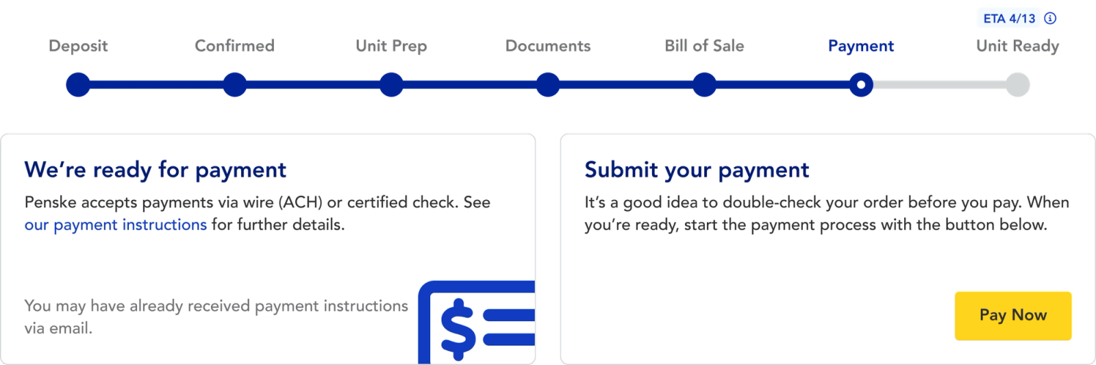
The progress indicator reveals more of the process and helps the user navigate it.
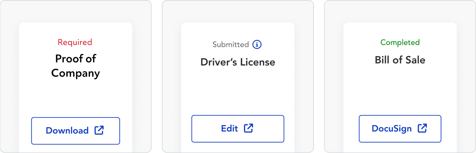
Documents have their own presentation now, complete with statuses, titles, and an action button.
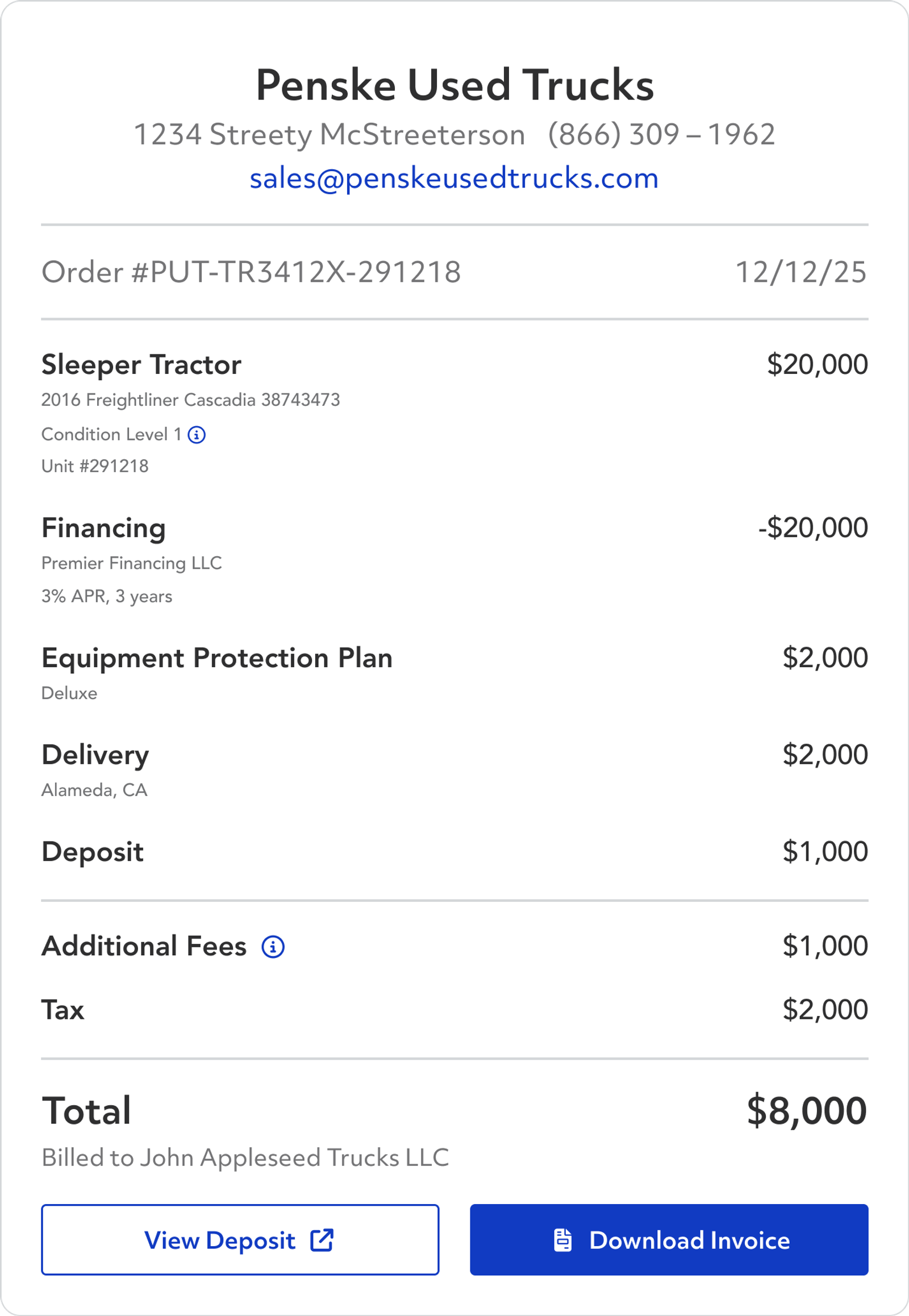
Purchase information is organized in a familiar receipt layout enhancing clarity and transparently showing expenses.
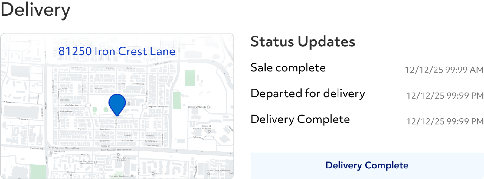
Pickups and Deliveries are shown on a map to indicate the spatial nature of the information.

Confidential Material Blocked
We user tested with 16 participants of across a range of familiarity with the truck buying process.


Confidential Material Blocked