Name Sprout
Problem
Naming a baby is a decision two people make together, but the browsing happens alone. Each partner scrolls a list on their own phone, and a list can't tell you how to say Niamh or whether Hazel is coming back. The odds work against couples too: two people who each rate 300 names at random from a pool of 5,000 agree on about 18 by chance.
Solution
A swipe deck where a name you both like becomes a match. Partners connect over iCloud with no accounts. Every card carries a meaning, an origin, how to say it and a century of popularity, and the deck quietly paces in your partner's likes so matches happen on purpose.
Name Sprout
Apr 2025 - Oct 2026
Personal
Name Sprout began in April 2025 as BabyNamer, a side project with my friend Varun Khatri.
Name Sprout
Apr 2025 - Oct 2026
Personal
Name Sprout began in April 2025 as BabyNamer, a side project with my friend Varun Khatri. Varun built the app's first structure, swipe deck and partner-sharing groundwork. I brought in the name data and designed the name card. From August 2026 I built it with Claude Code as my engineering partner, which let me spend my time on the design: framing each problem, making the calls, and testing everything on my own phone.
Problem
Naming a baby is a decision two people make together, but the browsing happens alone. Each partner scrolls a list on their own phone, and a list can't tell you how to say Niamh or whether Hazel is coming back. The odds work against couples too: two people who each rate 300 names at random from a pool of 5,000 agree on about 18 by chance.
Solution
A swipe deck where a name you both like becomes a match. Partners connect over iCloud with no accounts. Every card carries a meaning, an origin, how to say it and a century of popularity, and the deck quietly paces in your partner's likes so matches happen on purpose.
Maker
I did everything related to this project.
UX Designer
I designed the experience of using the product based on research, testing, and intuition.
UI Designer
I designed the visual and interactive experience of using the product to spark delight.
Interaction Designer
I designed how the user interacts with the products through input and output.
At a glance
8,500+
names, each with a meaning, an origin and alternate spellings
126
years of US birth records behind the popularity charts
14
design briefs, each recording what I declined
0
accounts, ads or subscriptions
Naming a baby is a decision two people make together, but the browsing happens alone.
Why a list falls short
Browsing alone
Each partner scrolls a list on their own phone, and comparing notes means reading names out loud to each other.
A list can't speak
It can't tell you how to say Niamh or Tadhg, whether Hazel is old-fashioned or coming back, or how common a name will be in your child's class. A name you can't say gets skipped on spelling alone.
The odds work against couples
Two people who each rate 300 names at random from a pool of 5,000 will agree on about 18 by chance. The moment the whole category is built around barely happens.
Four goals
- Make each decision quick and expressive. One card, one gesture, and a clear sense of what the gesture will do before you let go.
- Make agreement the reward. Partners connect once, rate on their own time, and a match feels like a moment.
- Give every name a fair hearing. Meaning, origin, alternate spellings, how to say it, and a century of popularity.
- Ask for nothing it doesn't need. No accounts, no ads, no subscription, and your list stays in your own iCloud.
Name Sprout began in April 2025 as BabyNamer, a side project with my friend Varun Khatri. Varun built the app's structure and its first Tinder-style swipe. I brought in the name data and designed the name card.
The card set the direction
Within the first week the card found the shape it still has. It takes its color from the name's gender, alternate spellings flow in a row along the bottom, and a gender symbol sits in the top corner, drawn to sit alongside Apple's SF Symbols. Tap the symbol and it wiggles. The wiggle survived every redesign.
What the prototype got right
A shared vocabulary
Spacing, color and type as design tokens. Every screen in the shipped app still draws from them.
A page for every name
Meaning, origin and popularity charts for every name, plus dark mode, search, and Varun's Matches page.
A name worth sharing
A shareable image of any name, the last thing we added in 2025.
I came back in 2026 with a name, Name Sprout, a new icon, and one rule: before building anything, write the design down.
What every brief recorded
By launch I had written 14 design briefs. Each one was something I could argue with, test against and revise.
The problem and the flow
What's wrong today, the path through the feature, and the questions still open.
Numbered requirements
What the feature has to do, and what's out of scope.
What I declined, and why
The options considered and turned down, so settled decisions stay settled.
From August on, I built Name Sprout with Claude Code as my engineering partner. That let me spend my time on the part that had always been design: framing each problem, making the calls, and testing everything on my own phone.
The deck is the app, so it got the most design attention.
The card is the feedback
Drag right or left
The card tilts and washes green or red, reaching full color exactly at the commit point.
Press and hold
The card waits half a second, then grows, shakes and washes amber while the screen dims. The super like fires at the peak.
Tap or drag up
The card grows into the full name page under your finger, reversible at any point.
Pull down
The card slides off its colored bar to reveal what letting go will do.
Undo
The card plays its exit backward.
The decisions behind it
Full color means “let go and it counts”
The wash maxes out at the commit point, so the card answers “how close am I?” without a label.
The super like charge fires itself
“Hold until it pops” needs no instruction. The half-second wait matches iOS's own long press, and the 0.8 seconds of visible growth after it is your window to change your mind.
Super like leaves toward you
Up already means “open,” and two outcomes in one direction would be unreadable.
Haptics form a scale
Light ticks that quicken as you drag, a firmer tick at the threshold, and for a super like a rising rustle into a final poof.
Tall cards are allowed to clip
The card is a preview, the fade at the bottom means “more below,” and dragging up is how you read the rest.
Every gesture has a button
Like, pass and super like always sit under the deck, so nobody has to discover anything. The gesture is the expressive way to do something that already has an obvious way.
A prototype built to be deleted
Five questions were too risky to settle on paper, so I had a throwaway prototype built to answer them, each behind a picker on one screen. One answer shrank the plan: Apple's built-in transition could already be dismissed with a drag, so a custom one never had to be designed. Another was a flat no. A gray stand-in for the chart, meant to keep the animation smooth, looked wrong in the hand: “Don't ship the placeholder, that's terrible.” Two days later the prototype was deleted and its answers written into the plan.
Testing in hand
I tested the whole interaction on my phone in one pass and wrote down everything that felt wrong.
1 page
of feel notes
4
decisions from paper overturned
What testing in hand overturned
Feel notes
Haptics
“Too sparse and too prominent,” so they became more ticks, lighter ones.
The shake
The right speed, and too much distance.
The colored bar
It was turning muddy, mixing gender and rating into a third color that was neither. Now it blends cleanly from one to the other.
Giving down a job
Down was deliberately inert until there was something worth giving it. Share and block both lived on other screens, so pulling a card down now slides it off its colored bar, uncovers a label saying what letting go will do, and opens a menu with both.
Moments worth stopping for
A match, the most rewarding thing in the app, used to happen invisibly. You only found out when you opened the Matches screen. I designed one panel component in Figma for three moments: a badge circle overlapping the top edge, a title, a slot that changes, and a pair of buttons.
[Image #9]: Match. The deck holds still during a match, because a new card behind the panel would put a different name under a panel naming this one.
[Image #10]: Super like. Super likes come five at a time, with a countdown to the next batch instead of a reset time, because a ticking number needs no arithmetic.
[Image #11]: Block. The same panel, with the same badge, title, slot and buttons.
Teaching it
By now the deck had seven outcomes, and a new user arrives knowing two. The tour that teaches the rest is asked at the door and committed once inside. A tour you can leave is one people leave halfway, having learned three gestures and forgotten which three; one you can't decline is a wall. So you choose once, each step advances only when you do the action, and if you hesitate the screen shows you the motion. It runs on a fictional card named Sprout, so nothing you do in the tour is recorded.
Partner sharing is why the app exists. It runs on iCloud with no accounts: one partner sends a link, the other taps it, and from then on each person's likes show up on the other's phone.
Drawing the privacy line
What a partner can see was a deliberate design decision.
What they see
The names you like, the names you add, and your first name.
What they never see
Which names you passed on or blocked.
What they count
Only a count of passes, so the stats can be complete without exposing any single “no.”
The shared experience
A connection you can see
The old partner card said whether you were connected in the flattest way possible: a glyph, a name and a status word. Now you sit at the top, your partner below, and a live link runs between your avatars with the app icon in the middle, pulsing inward from both sides. As you scroll it shrinks to a pinned capsule.
[Image #13]: The partner profile header, with the live link between avatars
How are we doing
The page behind the header stopped answering “are we connected” and started answering “how are we doing,” with charts of how each of you rates names. They count from your very first rating, and totals stay a simple scoreboard.
[Image #14]: Charts of how each partner rates names
Three pages, one bar
Your likes, your partner's likes and your matches became three pages you swipe between from one bar.
[Image #15]: Likes, partner likes and matches under one bar
An envelope worth opening
Inviting a partner became an illustrated envelope with a flap, a lining and a card inside, and the person receiving it gets an onboarding path of their own.
[Image #16]: The illustrated invitation envelope
One count, everywhere
A match often lands while you aren't looking, so the app sends a notification, offers to replay matches you haven't seen, and shows one count on both the Matches tab and the app icon, so the two badges can never disagree.
[Image #17]: A match notification and the matching badges
- Partner liked: names your partner liked that you haven't rated. Creates matches on purpose.
- Your taste: names weighted by your own ratings, for personal relevance.
- Shared space: names weighted by your partner's ratings. Names you'd both probably accept, before either of you has seen them.
- Chance: names at random, for variety and no filter bubble.
Considered and declined
A swipe is only as good as what you know when you make it.
Every name is cleaned by hand, and the whole catalog lives on your phone, so it works offline.
8,500+
names, each with a meaning, an origin and alternate spellings
126
years of US Social Security birth records, 1900 to 2025
~6%
of names ever reached the top 100
A century of popularity
Every chart uses the same scale
Lines are drawn against the top 100 places, so any two names compare at a glance. A chart that scaled itself would make a name that peaked at 40th look the same as one that bottomed out at 20,547th.
[Image #18]: Two popularity charts on the shared scale
Rare names still get a line
At first most cards had no chart at all. Names that never made the top 100 now draw in the bottom tenth on a log scale, and the roughly 3,500 that never made the top 1,000 collapse into a short strip of dashes.
[Image #19]: A rare name on the log scale, and the strip of dashes
Read any year
An early version smoothed the line by skipping years, and got the headline rank wrong for most of the names it charted. Now every year is there, and a finger can scrub the chart to read any of them.
[Image #20]: Scrubbing a chart to read a single year
Old-timey or hip
The obvious single number failed. Hazel's average year of use is 1951, the one decade nobody used it, because the average of a name that was popular twice lands in the gap between. So each name stores its eras instead: Hazel is 1900 to 1949, and 2010 onward.
[Image #21]: Hazel's chart and its two eras
How do you say it?
A name you can't pronounce gets swiped away on spelling, so the card learned to speak. The obvious version, reading each name in its origin's voice, had a trap: a name's origin says where it came from, and says nothing about the language it's spelled in. A Hebrew voice given the Latin letters “Jacob” mangles it. So the voice follows the spelling. Names written in their own language's spelling, such as Spanish, Italian, Polish or Irish Gaelic, get that language's voice. Transliterated names, and English names with foreign roots, are read in English. The speaker button only appears where the app can say the name correctly, and a hand-written pronunciation always wins over any rule.
Name Sprout speaks in a serif and colors every name by gender, and both choices go back to the first month of the prototype.
The visual system
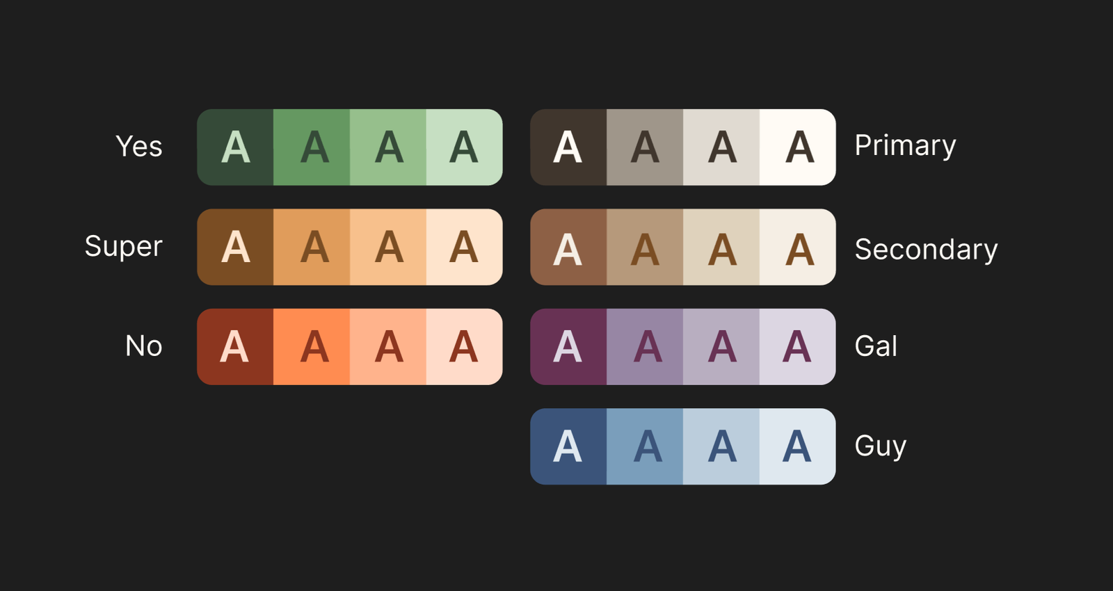
4 shades of colors for rating, gender, and surfaces. Colors are always used at full strength (no transparency).
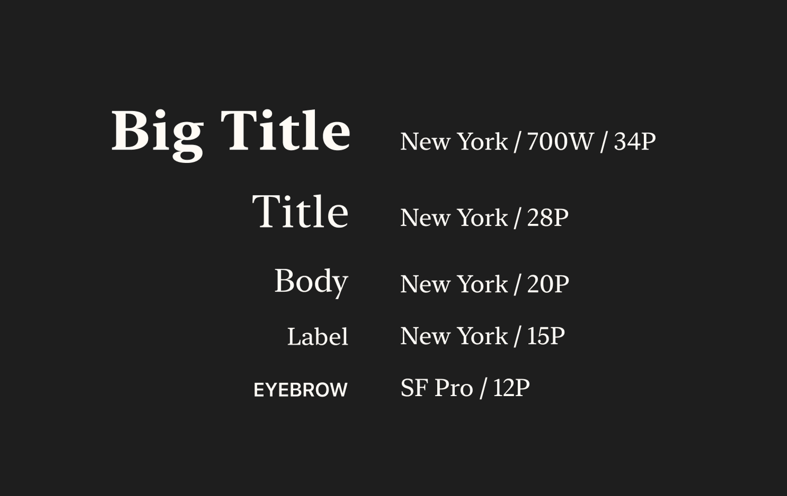
Names, titles and body text are set in New York, Apple's serif. Small labels like "ORIGIN" and "APPROXIMATE MEANING" are set in the system sans in all caps.
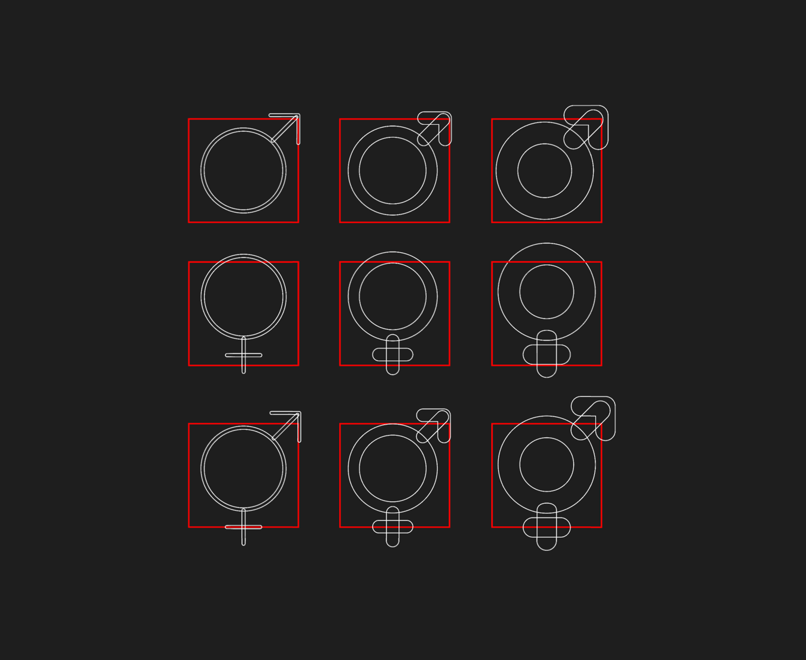
The name's gender symbols were made from scratch in Figma. They support variable weight, animation, and hierarchical coloring.
Onboarding as a first impression
The first onboarding read like a settings form, so its middle became two purpose-built steps. A 2×2 gender picker offers Boys, Girls, Both and All, where Both means unisex names only so every tile is meaningfully different. Then a 3D Apple Maps globe and a bottom sheet drive each other: spin to a continent and the sheet follows, or pick from the sheet and the globe flies there. A globe that only reacted would be an expensive illustration, and one that only drove would leave Oceania nearly impossible to tap.
- Larger Text: every type style scales, and long names get a hyphenated second line instead of an ellipsis that turns a name into a different name.
- Increase Contrast: strengthens the ink and never touches the page, reaching 7:1 in light and dark mode.
- Reduce Motion: swaps flying cards for dissolves, and a super like stops growing and shaking.
- Differentiate Without Color: gives the stats bars patterns: solid, dotted and slashed.
- VoiceOver: reads each popularity chart as one sentence instead of point by point.
Showing up across iOS
The goal I wrote down was craft, not growth: be present wherever iOS looks for an app, for people who already have it.
![[Image #27]: Home-screen widget with a new name every hour, rated in place](/media/62f18ee736bdd6cd9183cbb448e6f71213047714-812x476.png?w=300&fit=crop&auto=format&q=75)
![[Image #31]: The App Clip, rating names without installing. If they install later, those ratings come with them.](/media/62f18ee736bdd6cd9183cbb448e6f71213047714-812x476.png?w=600&fit=crop&auto=format&q=75)
Details that add up
[Image #33]: A frosted fade at the bottom of the deck, so a card dissolves under the buttons instead of stopping at an edge.
[Image #34]: Four app icons, the default plus boy, girl and neutral versions, each in light, dark, tinted and clear.
[Image #35]: Liquid Glass buttons on iOS 26 that keep their original look on earlier versions.
Name Sprout went to App Review on September 30, 2026, and is now on the App Store as Name Sprout: Find Baby Names. It's free, with no ads and no subscription.
Totals, never people
Each phone sends one day's totals per name (views, likes, passes, blocks and matches), with no account, device or name attached. Only the running counts are kept.
The easy option, declined
Apple's free iCloud database would have been simplest. It was ruled out because it tags every record with who sent it, permanently.
A switch to turn it off
A switch in Help turns the counting off. There's no stats screen behind it; the app never tells you what it counted.
Day one
The day after submission, I designed for iPhone Duo, Apple's foldable. Folded, its outer screen moves the tab bar and toolbar into a strip down the side. Open, it's wide enough for Matches to show two columns and for Settings to sit beside its pages. No other iPhone's layout changed.
The biggest change across the project was in how I worked on it.
In 2025 the decisions lived in our heads. In 2026 every feature started as a brief I could argue with, test against and revise. With Claude Code handling the engineering, the design artifact became the decision itself, and that's what let one designer ship an app this size.
Principles that came out of the work
Write down what you declined
And amend it when reality disagrees. The most useful notes in the project say do not retry this. They stopped me reopening settled decisions weeks later.
Build a throwaway, then delete it
The gesture prototype lived for two days, answered five questions, and removed a whole custom transition from the plan.
The hand beats the plan
One round of testing on my phone reverted four decisions made on paper. Feel can't be specified ahead of time; it has to be tried.
Give every expressive gesture an obvious twin
The press-and-hold super like needed no tutorial and no opt-out, because the button next to it does exactly the same thing.
Keep the machinery invisible
The deck learns, the speaker hides when it can't say a name, and nothing explains itself.
Let constraints set the design
The privacy label decided what the app counts, and Apple's rule that partial accessibility isn't support decided the scope of that work. Both made a better app.
Recognition
