
Problem
Scores in personal games can be hard to remember if you're playing and keeping score by yourselves. The problem of scorekeeping is vast — there are lots of different ways to do it, some more strightforward than others.
Solution
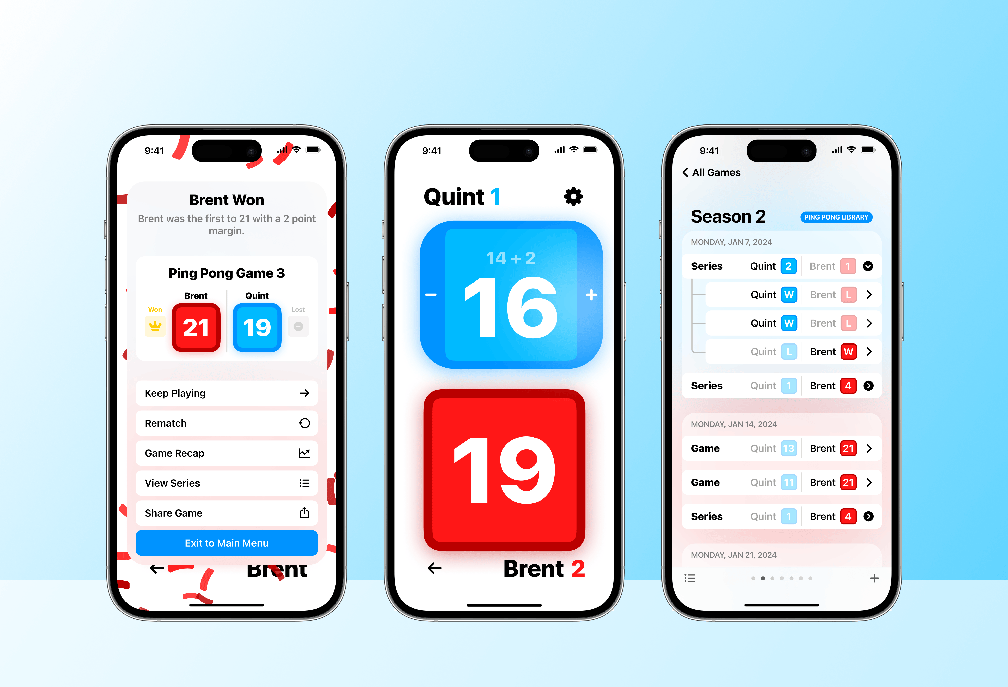
ScoreKeep is an app that offers delightful interactions, helpful scorekeeping tools, and logical organization so you can focus on the game instead of the numbers behind it.
Features
Basic gameplay
Tap to +1
The main gameplay screen involves tapping on a score to increase it and renaming players. This is the most basic usage pattern of ScoreKeep.
Each game has its own settings where you can rename the game or players, manually enter a score, or turn on the main features listed below.
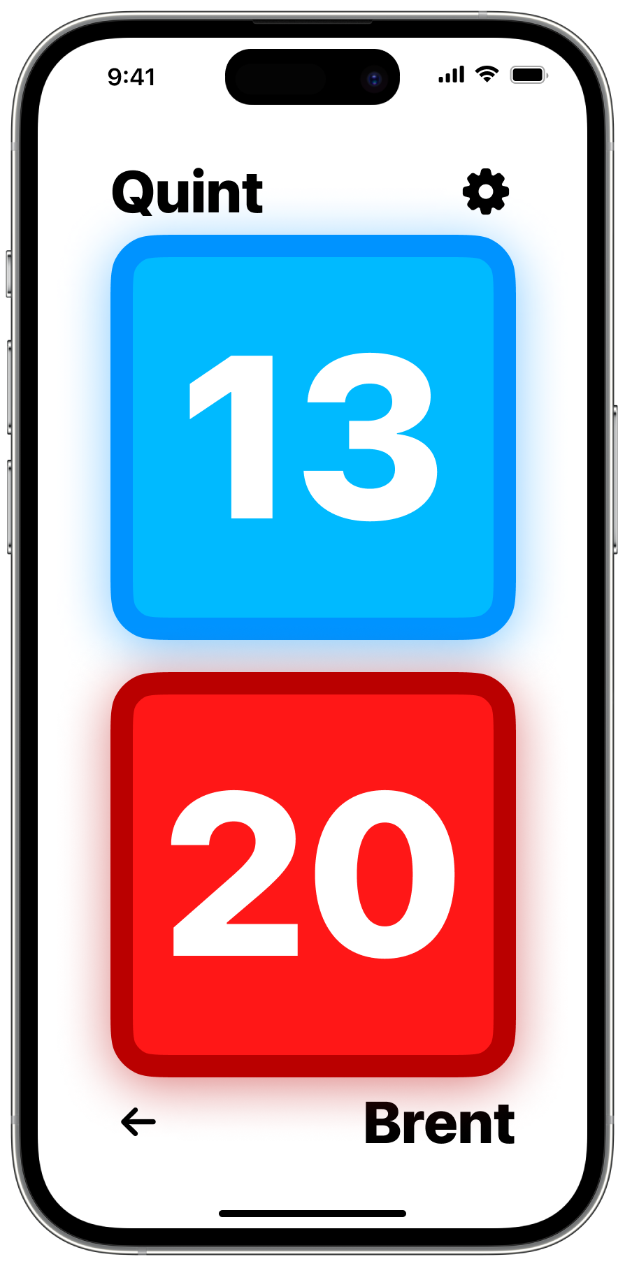
The main ScoreKeep screen
Timer
The final countdown.
Add in a timer to count up or down during your game. Tap to pause and resume.
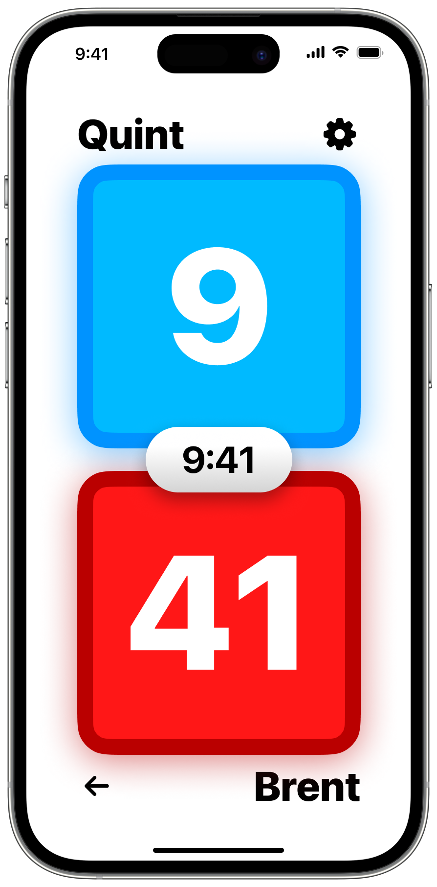
What the timer feature looks like during a game
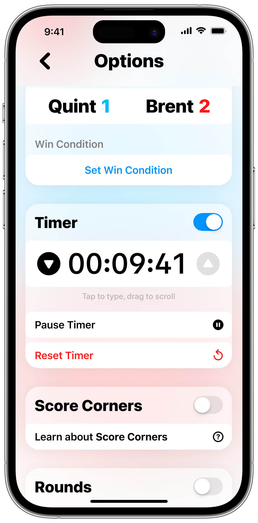
Timer controls in game settings
Rounds
Have some rounds on us.
Rounds is a feature that’s perfect for golf, bowling, corn hole, or any other sport where scoring is segmented into discrete groups and added together at the end.
When you tap, the score for the current round increases. After a few seconds, it moves to the left and a new round is automatically created.
Each player’s total score is shown in the middle of the screen so you can see the total at a glance. The timer for the round moving on is shown as a darker outline around the player’s card and moves to the middle.
To browse rounds, swipe left and right. The currently displayed round is shown at the top right, and if it’s different than the most recent round you can tap it to go back to the current round.

What rounds look like in a game
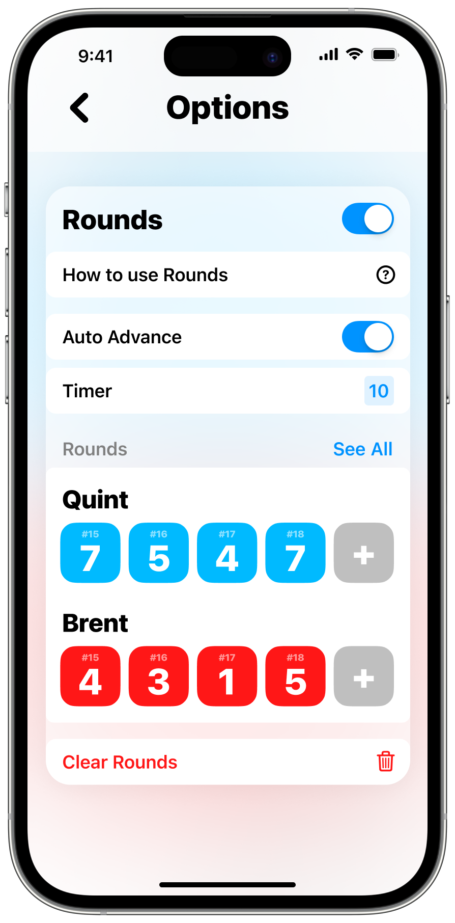
Configure rounds in the game’s settings
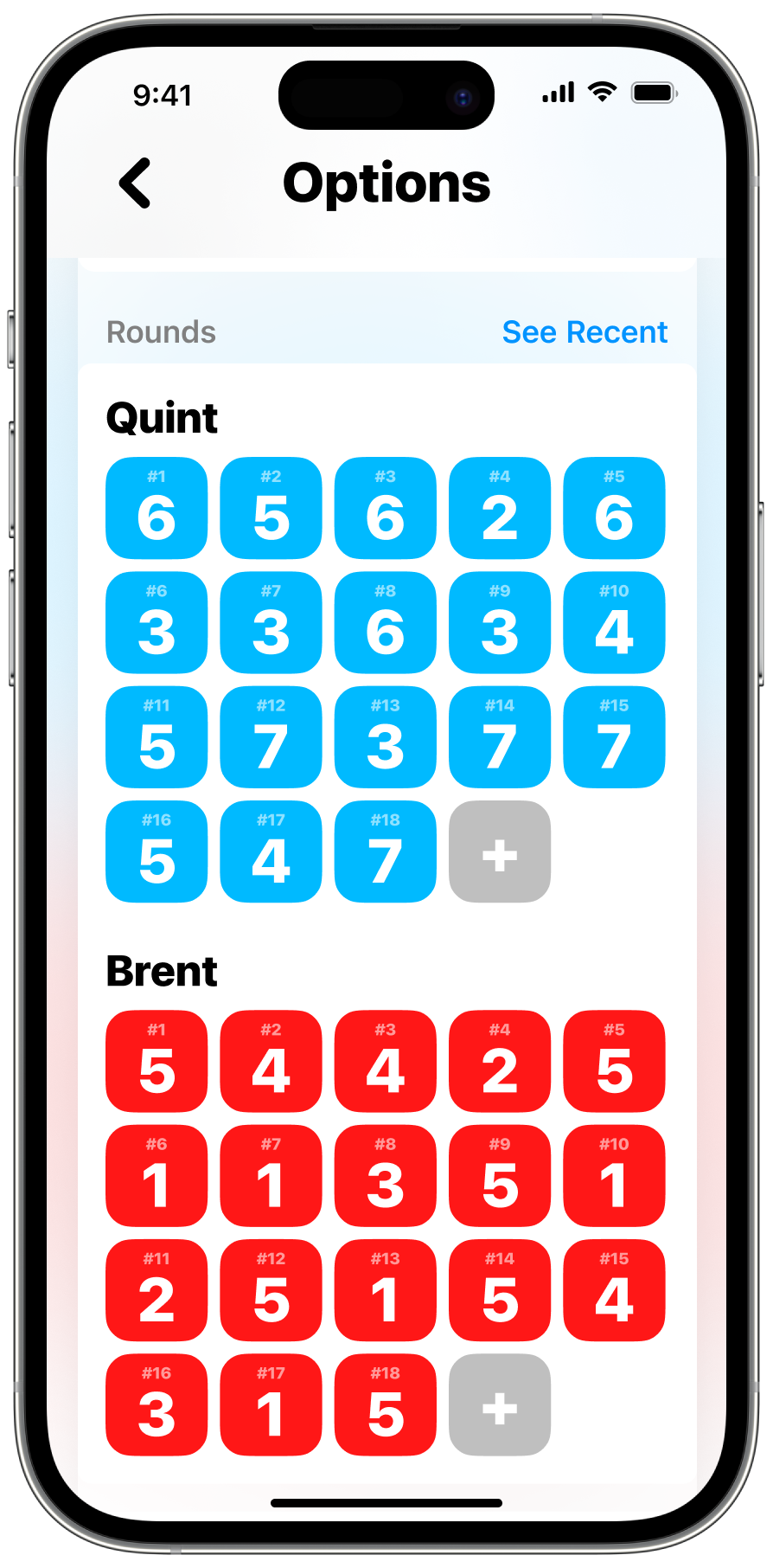
See all the rounds in the game and edit or add more
Score corners
Save yourself a tap... or six.
Some sports like football, basketball, and tennis have a set way to score. In football for example, you can score 1, 2, 3, or 6 points at a time. Scorekeep lets you choose custom increments that add a different amount if you tap in the corner of the player card.
You can search for supported sports (every olympic sport and more are supported) or make your own custom sport in the game settings.
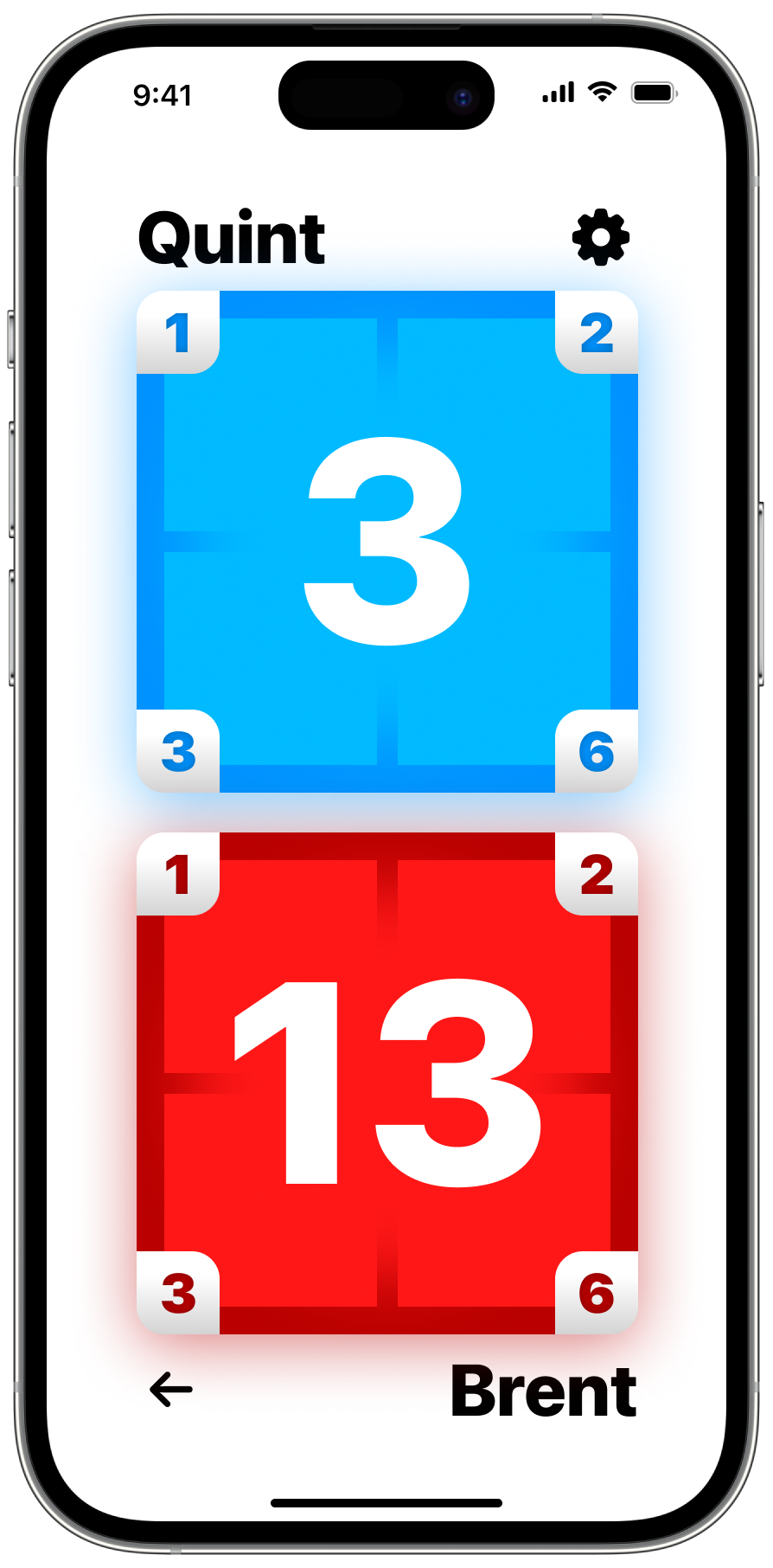
What score corners look like in a game.
Tap a corner to add points.
Tap a corner to add points.

Configure score corners in the game’s settings
SubScores
Fine. Sweat the small stuff.
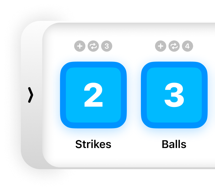
Sometimes, you want to keep track of a score that isn’t directly related to the points of the game, like time-outs in football and basketball, or balls, strikes, and outs in baseball.
With subscores, you can turn on a drawer of these less important scores and pull them out whenever you need to. Make a new subscore by naming it and choosing whether it counts up or down or cycles.
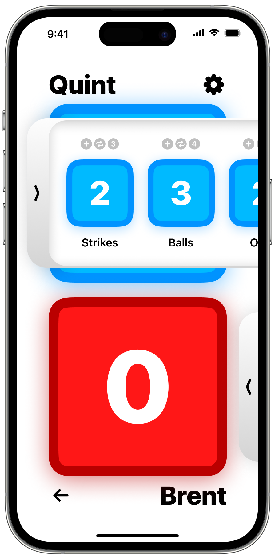
What subscores look like in a game. Tap or swipe to expand the drawer and edit the scores.
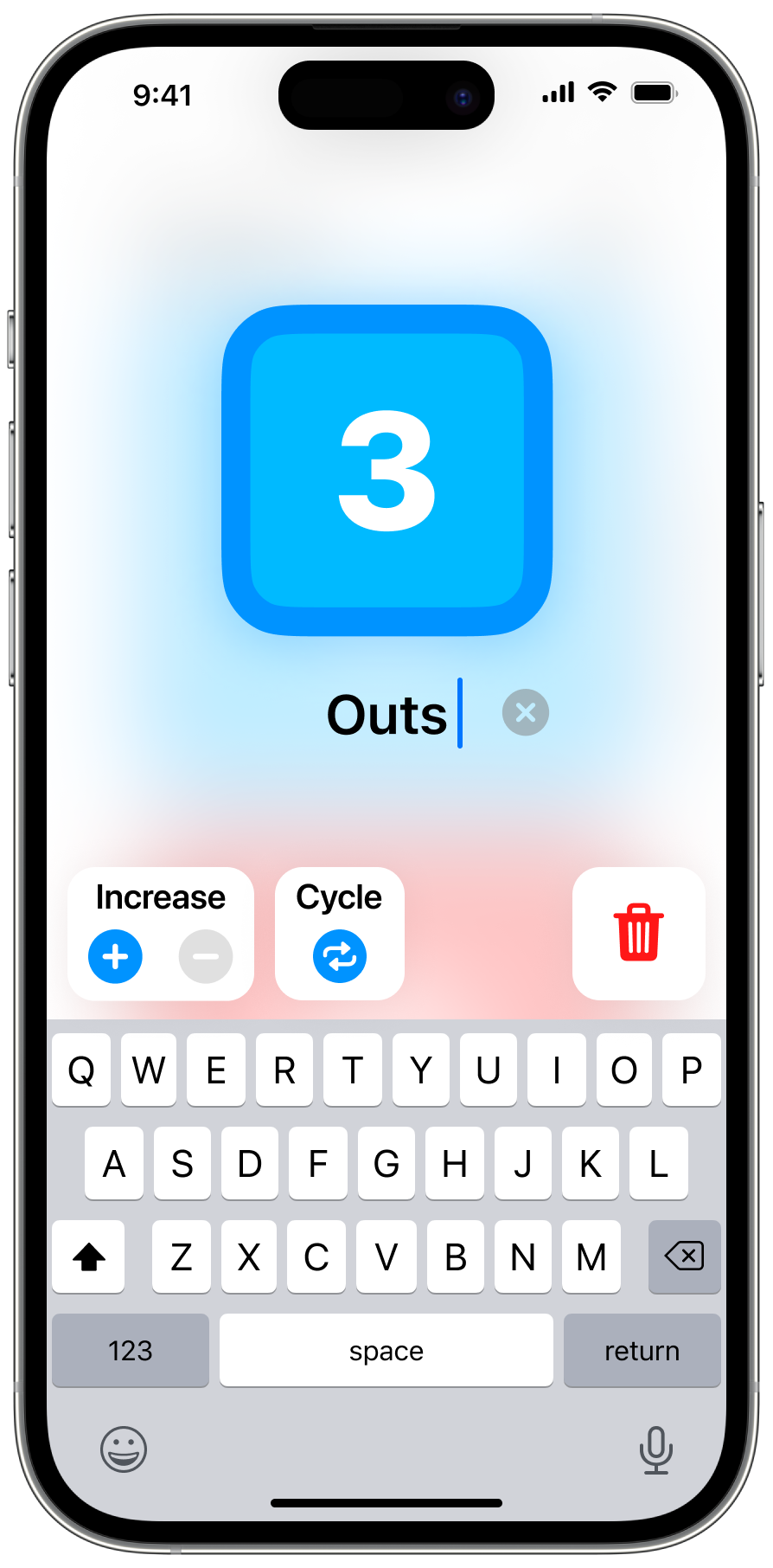
Easily create subscores in the subscore drawer
Customization
Your game, your way.
Change each players’ color, rename them, and edit the score in the settings menu.
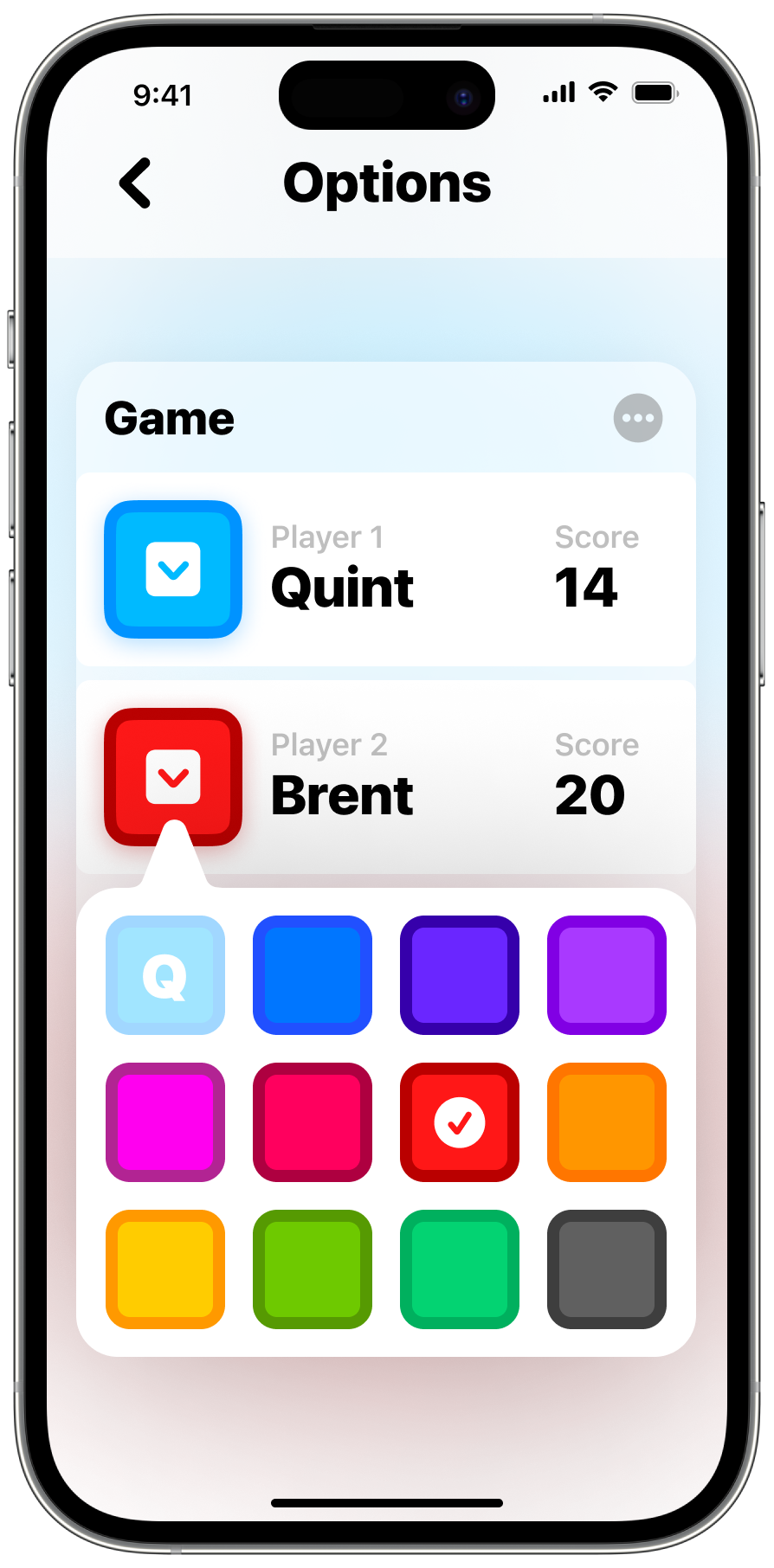
Easily edit game settings
Win Condition
Three – Two. Won.
Set a win condition to automatically choose a winner once certain criteria is met.
Choose between three different conditions:
- Highest or lowest score after a period of time
- Highest or lowest score after number of rounds
- First player to reach a score by a margin
After a single win condition is met the game presents the end card and congratulates the winner!
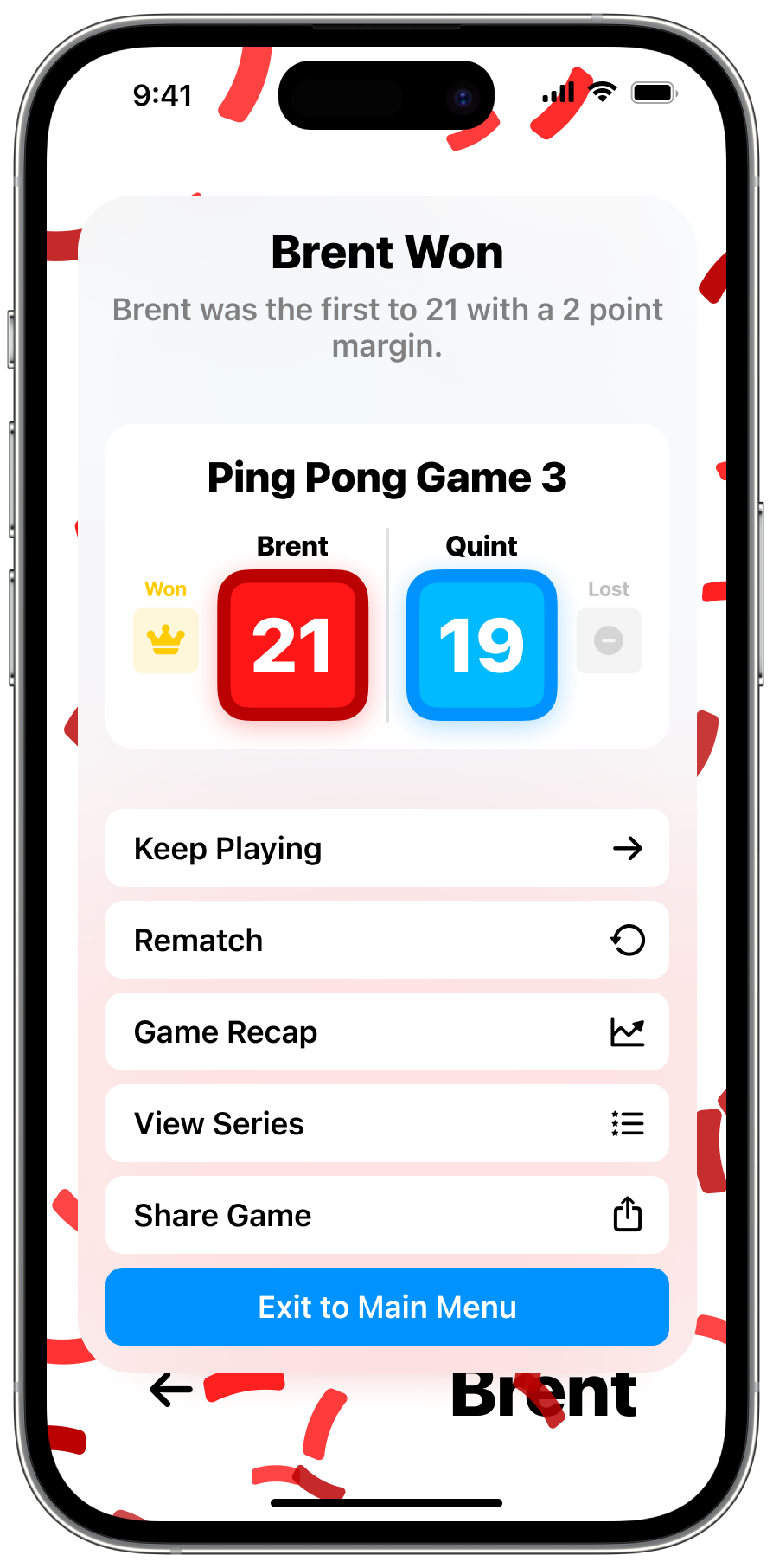
Automatically set a winner after criteria is met
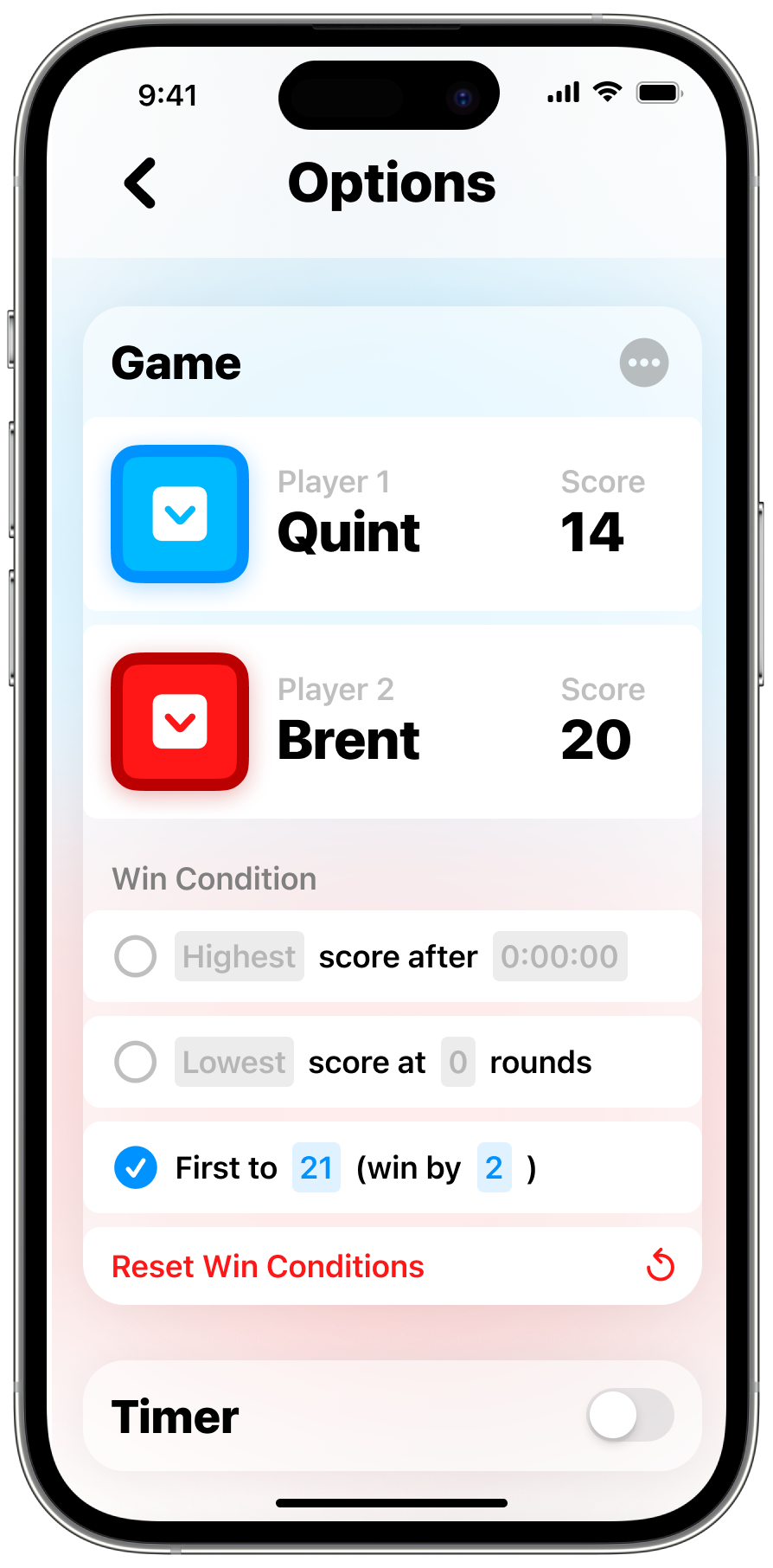
Set up a win condition in the game’s settings
share games
Spread the news about your big win.
ScoreKeep comes with a powerful share feature that lets you customize an image to share wherever you want. Add whatever information about the game you want and get an instant preview above.
When you’re ready, send it to your friends in a message or post it to Instagram — or any other app that accepts input as an image.
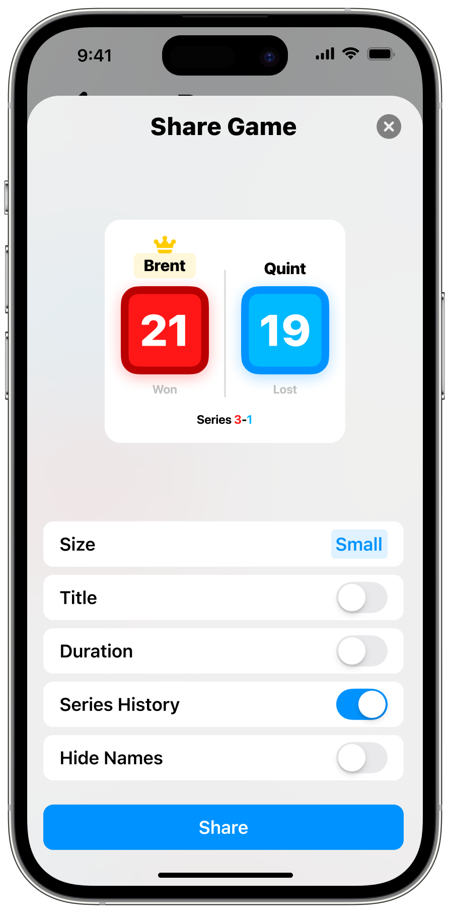
Customize the shared image with information you choose
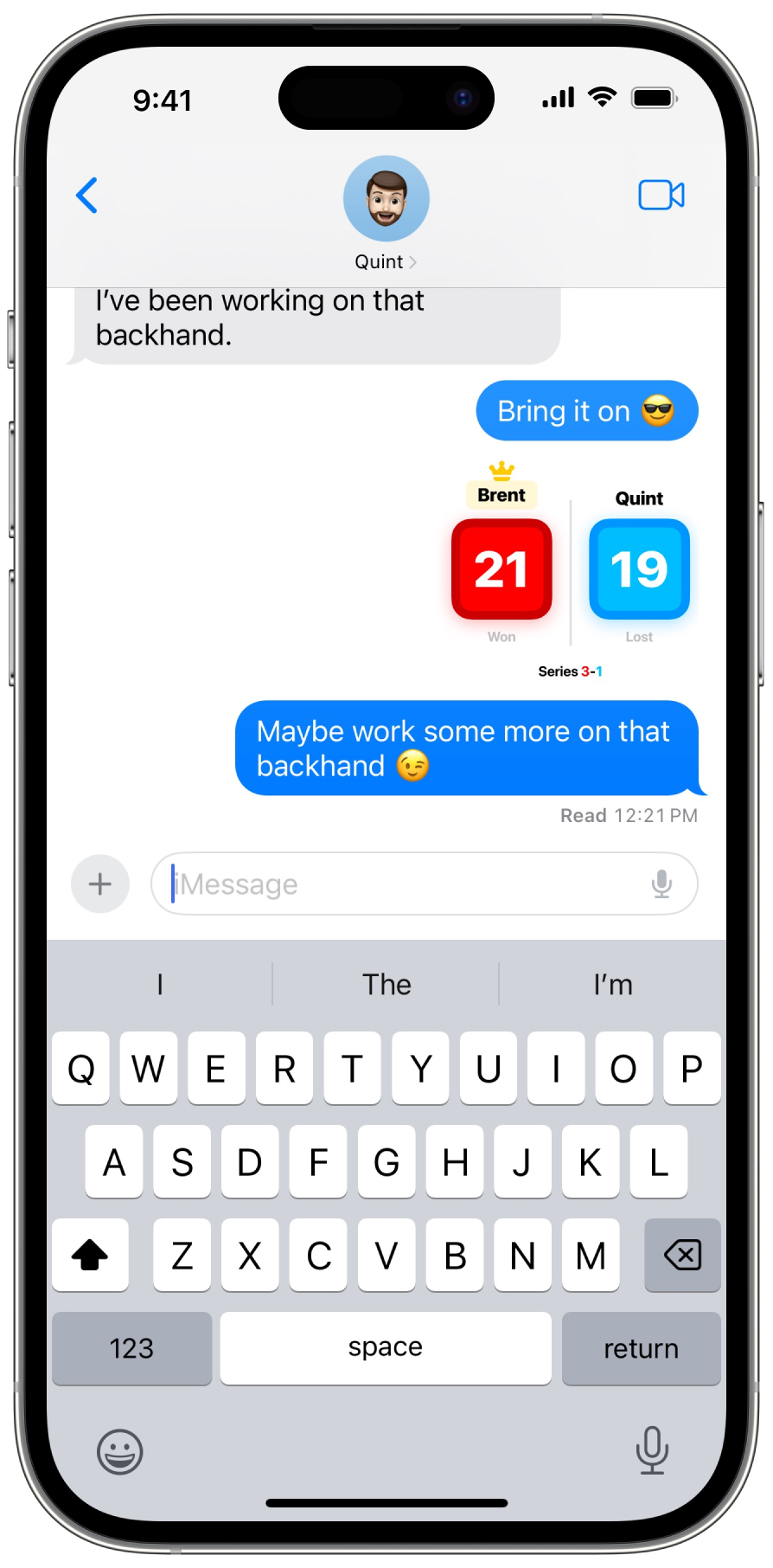
Send it in a message or anywhere else as an image
Organization
League, Season, Series, Game.
There are four levels of hierarchy to organize your games in the way that makes the most sense to you.
A game is the base level. If that’s the only level you want to deal with, that works!
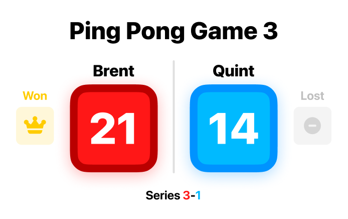
A series is a group of games that are related to each other. To start a series, tap the “rematch” button at the end of a game or by tapping and holding the game in the games list. If a game has a series associated with it, it will display the number of wins next to the players’ names.
A season is a group of games or series that are related to each other less directly than a series. These can be a group of games over the course of a year, games of a similar sport, or anything else you want to group them by.
Finally, a league is the top level of organization. You might want to use different leagues for different parts of your life — like a child’s sports vs your own sports.
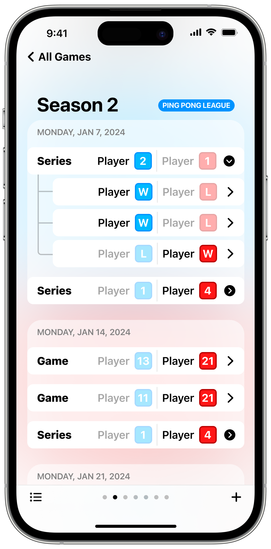
A list of games and series in a season of a league
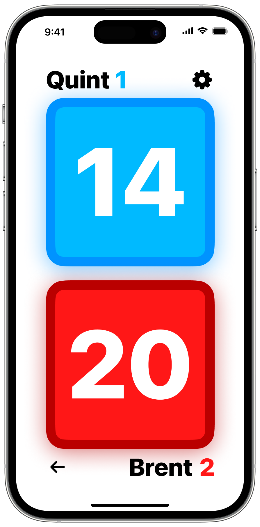
Series wins as displayed in-game
game Recap
Your personal post-game report.
After each game, Scorekeep generates an after-action report so you can check your performance. Add the game's location, or write a note to yourself about the game.

Post-game recap of a game showing the overview and score history
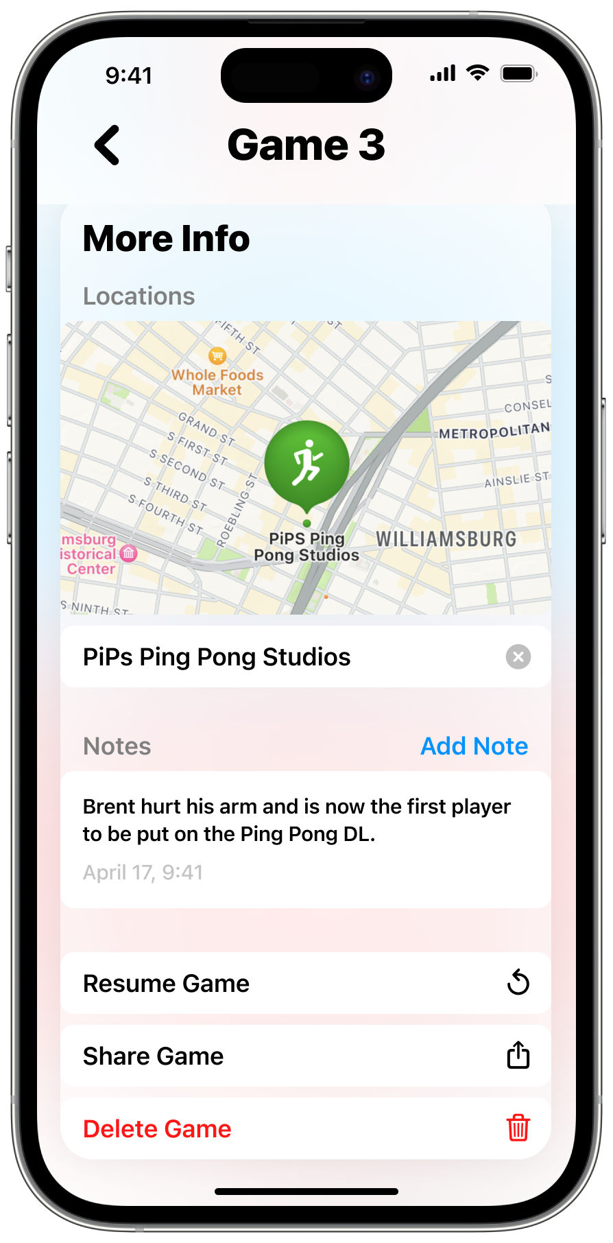
Optional, additional information can be added
Design
Color
Quite the palette!
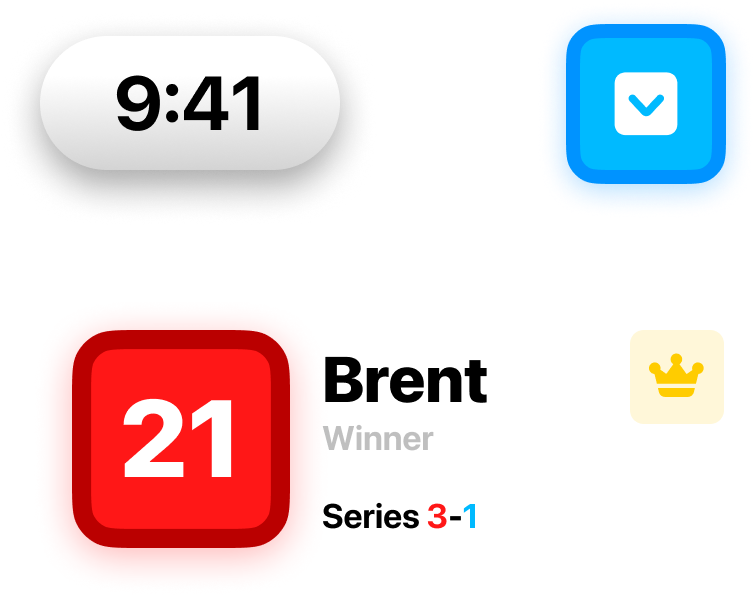
ScoreKeep’s colors are playful and vibrant. All primary and most secondary colors are available so players can choose the one they think best fits themselves.
When high-contrast mode is enabled, ScoreKeep switches the outer and inner colors for 100% APCA vision accessibility compliance.
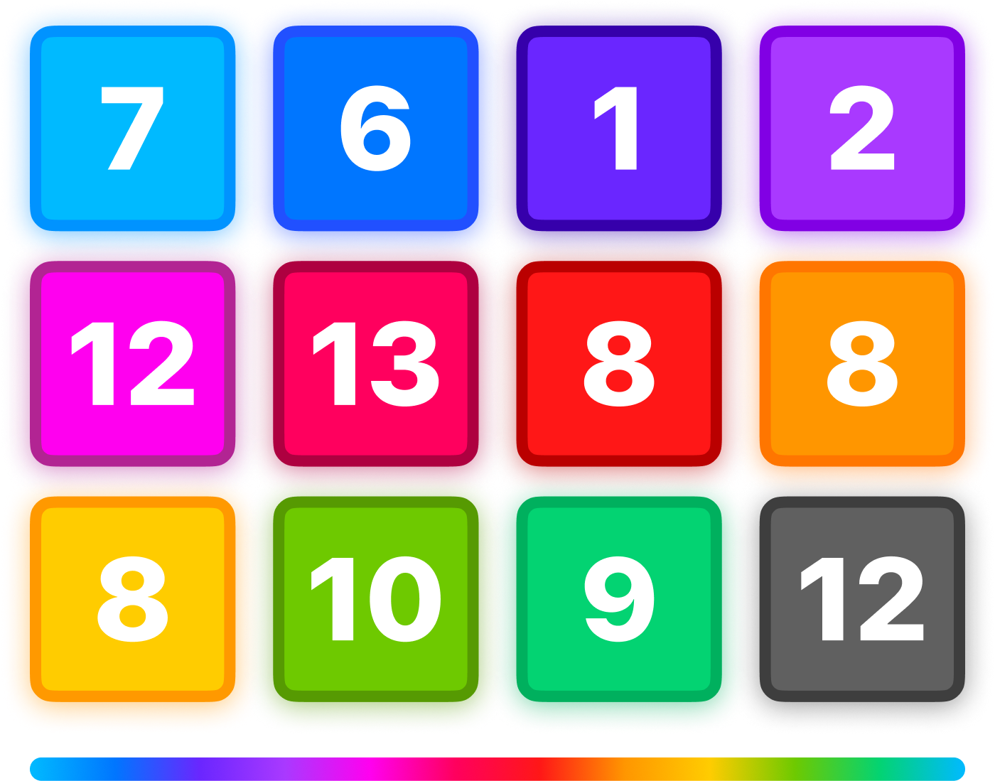
Main colors

Alternate accessible colors
Typography
Just your type.
ScoreKeep’s typography is bold and big. SF Pro, Apple’s system font, was chosen for its versatility and clarity. It also integrates with the system icon provider SF Symbols, which are used throughout the app.
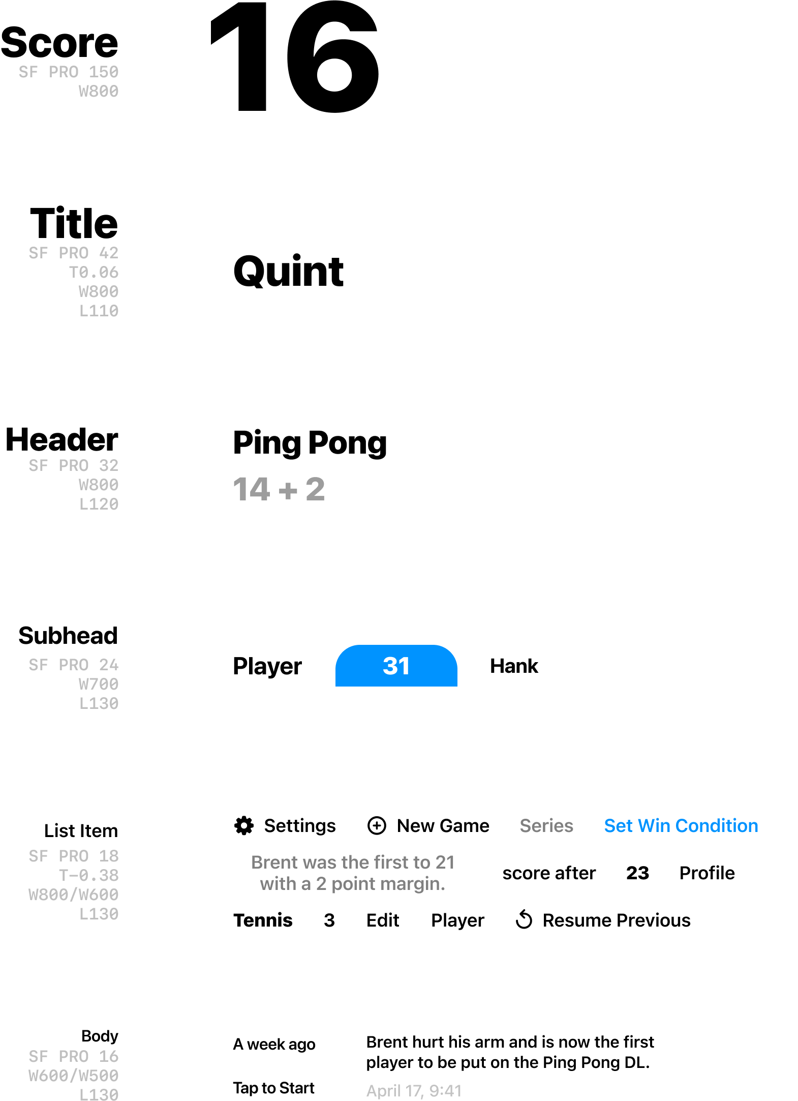
All the type specs with references on the right
glyphs and icons
Iconic by design.
ScoreKeep’s iconography is exclusively sourced from Apple’s SF Symbols library due to its uniformity with the system and its consistent design. Using the heavy and filled icons where possible mirrors the typography for visual consistency.
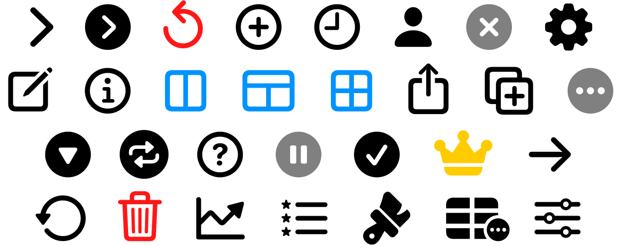
All the icons used in ScoreKeep
Controls
Lights, camera, interaction.
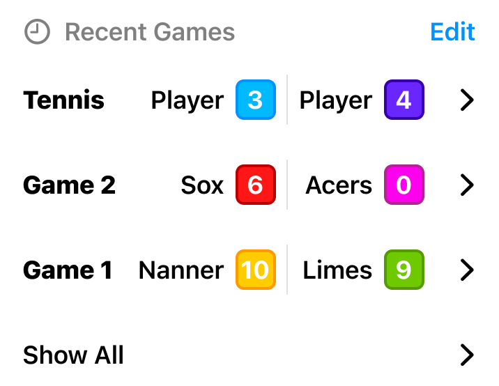
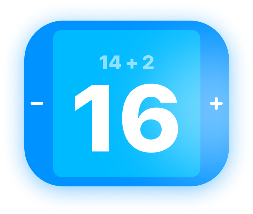
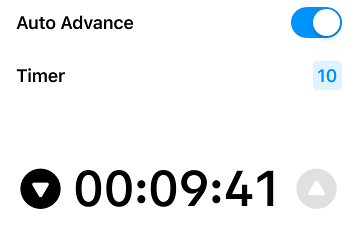
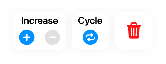
Interactive elements in ScoreKeep have a distinctive style that encourages direct touch and expressive gestures. Overlay elements have a subtle gradient evocative of aluminium, while the rest of the UI takes hints from the players’ chosen colors.

Experience Considerations
Main interaction
The Big Button™
At a base level, ScoreKeep’s experience is two squares with a number in them. If you tap the square, it increases the score.
For a majority of use cases, this is enough. Most users might never need to go beyond this functionality.
Keeping in mind more advanced users, the interactions are accessed in an order that makes sense for how big of a change they make:


Modular design
All together now.
While it’s not likely the user would ever need to use all the features at once, I worked hard to ensure a design that allows each feature its own reserved space.
This also helps with ease of recognition as the user doesn’t have to distinguish between multiple elements that could fill a slot.
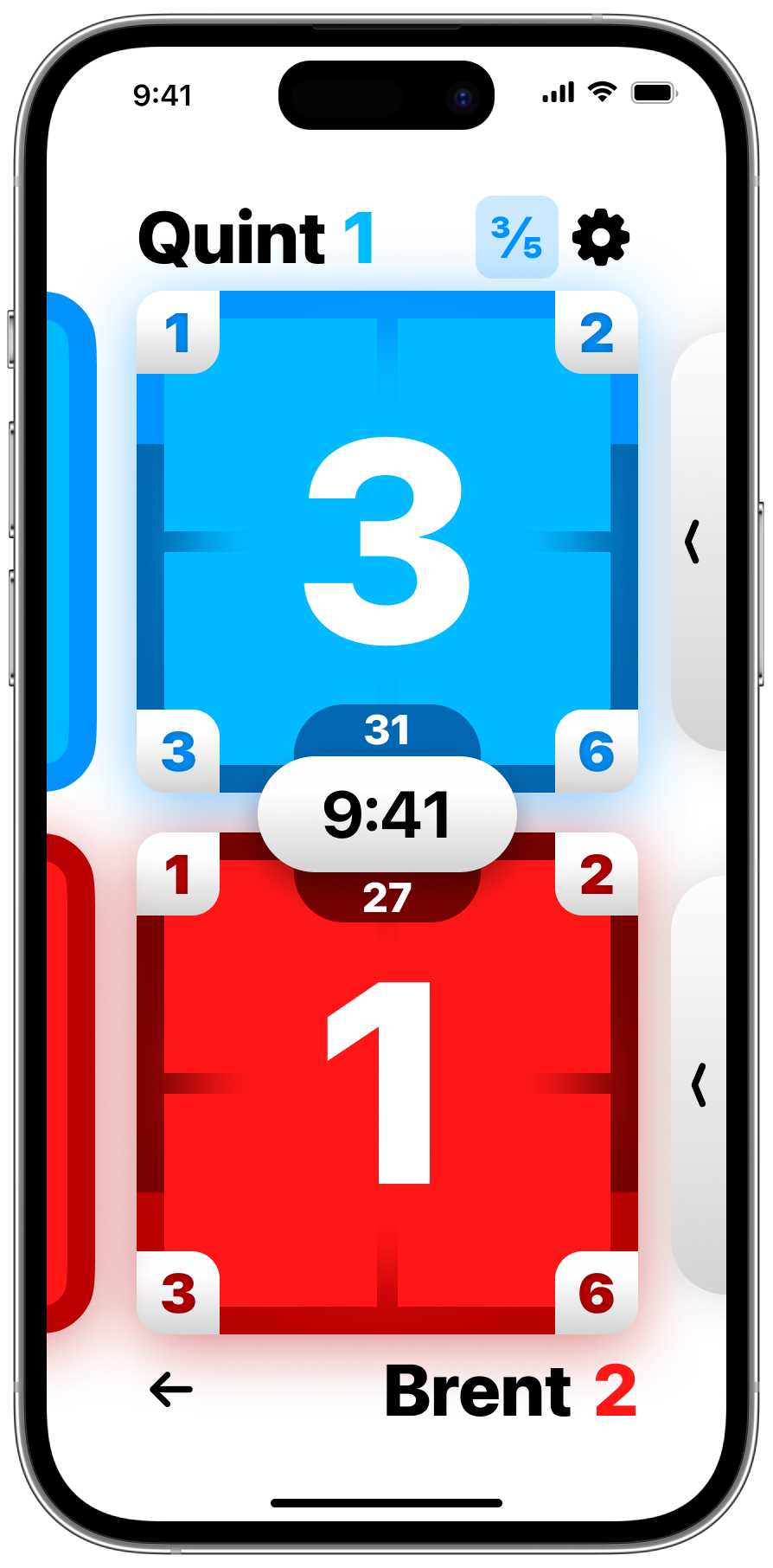
If you look hard enough you can find order in the chaos

False-color map of all the features’ reserved spaces
Data model
Thank you, Mr. Data.
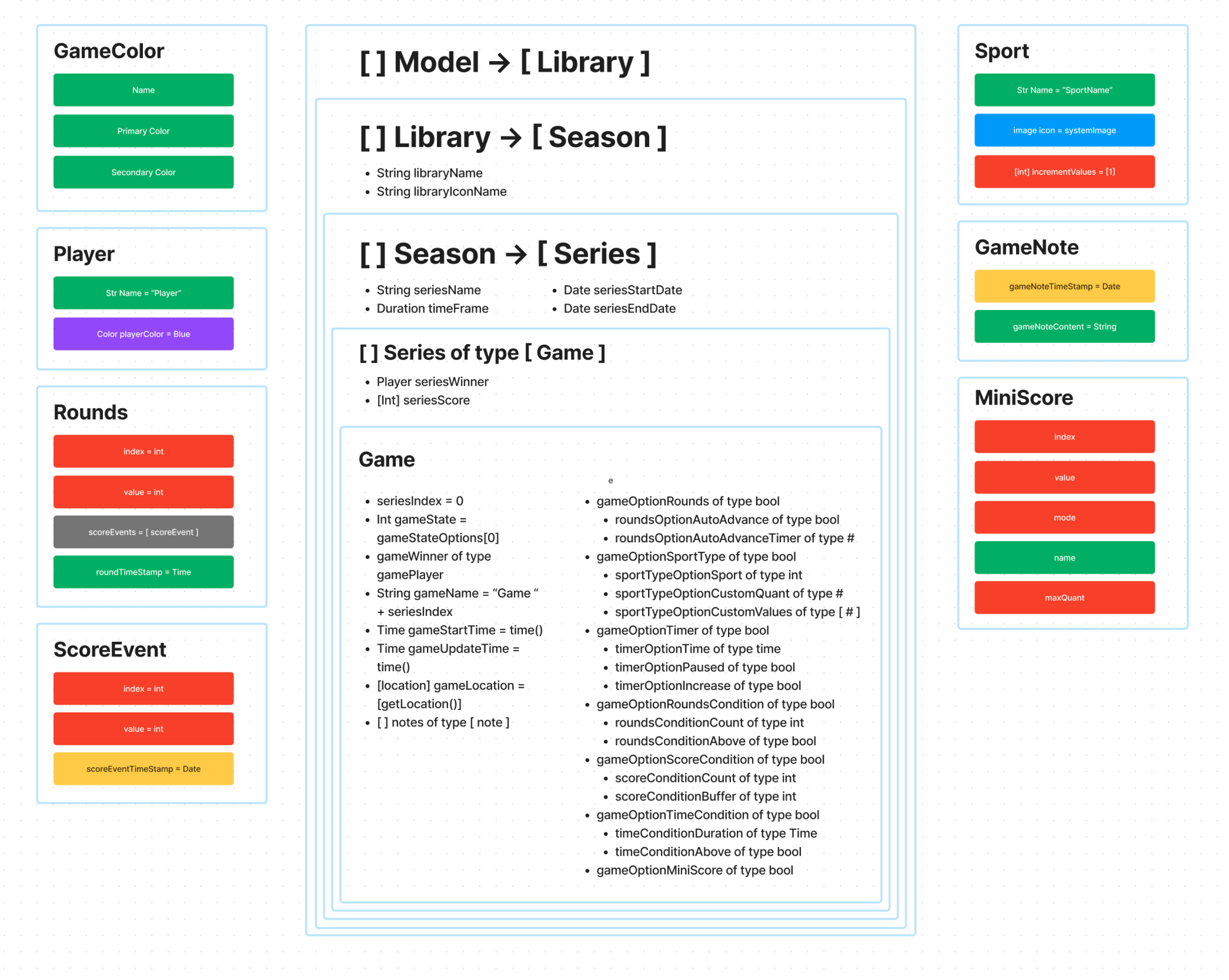
The next step after the features were designed was creating the data model.
I used FigJam to visualize objects and the main model. Each of these eventually resolve to a primitive like String or Int.
Closing thoughts
I'm excited to start an attempt at development and eventually monetization. If you have any questions or would like to beta test, reach out to hi@quint.design.